 ← All Work
05 — Experiential Design
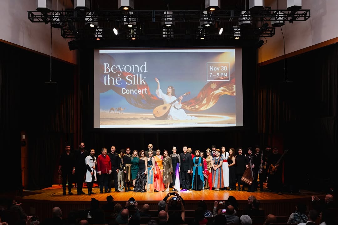
Silk Road Event Identity
Experiential Identity System Across Two Major Cultural Events
2
Major Events, One System
Recognized
For Clarity and Reliability
Project Details
Role
Lead Visual Designer, Brand Identity and Visual Systems
Tools
Figma · Adobe Illustrator · Adobe InDesign · Adobe Photoshop
2 events · 6 weeks · Every touchpoint
Overview
A cultural event identity that only works in one format, at one scale, or under ideal production conditions is not a system. It is a poster, not a system.
Cultural event identity design is a systems problem disguised as a branding problem. For Silk Road 2 and Beyond the Silk Concert, the challenge was building one visual language that could authentically represent diverse cultural heritage, scale from a pocket program to a full stage backdrop, and survive six weeks of multi-partner production without losing coherence.
Silk Road Events · Experiential Design05
01
The Challenge
- Single identity representing multiple distinct cultural traditions without creating hierarchy between them
- Scale requirements from pocket program to full stage backdrop within one system
- Six-week production timeline with multiple external vendors working simultaneously from shared assets
- Print and digital applications with fundamentally different production requirements
- Cultural accountability to the communities represented by the events
02
My Role
I led the complete identity system from design principles through production-ready delivery. I defined the conceptual framework, built the visual language, directed all format applications, and managed the system handoff to external production partners working under live event conditions. Delivered within six weeks.
Process
How I approached it
01
Principle Before Aesthetic
I derived three design principles from the historical Silk Road narrative before making any visual decisions: Flow representing movement and exchange, Connection representing the network between cultures, and Layered Cultural Motifs representing the blending of traditions. These principles became the filter for every subsequent decision.
02
Modular System Architecture
I built the visual language as a system of combinable elements rather than fixed compositions. Curved flow forms, network structures, and layered pattern elements could be combined in any configuration without losing coherence. This modularity was not a style choice. It was the only architecture that could survive multi-partner production at scale.
03
Production Reality Testing
The system was tested across all required formats simultaneously before any production began. Stage projection, print poster, digital header, large-format banner, and sponsor collateral. A system that fails at any one of these is not complete.
04
Partner Handoff System
I built production-ready asset libraries and usage documentation that allowed external vendors to produce materials independently without creating inconsistency. Under live event conditions, the clarity of your handoff determines whether the system survives.
The Solution
A modular event identity system built on three cultural design principles, scalable from pocket program to stage backdrop, and resilient enough for six weeks of multi-partner production.
- +Three-principle design framework: Flow, Connection, and Layered Cultural Motifs, derived from historical research not decorative reference
- +Modular graphic language scaling without redesign from print to stage projection
- +Production-ready asset library enabling external vendor independence under live event timelines
- +Unified color and typography system calibrated for both screen and print reproduction requirements
- +Full event ecosystem: posters, banners, signage, social, stage, and sponsor materials
2 events · 6 weeks · Every touchpoint
Key Decision
The decision to build the system around three abstract principles before making any visual choices. Flow, Connection, and Layered Cultural Motifs became filters rather than references. Every subsequent decision could be evaluated against them rather than against subjective aesthetic preference.
The Tradeoff
Abstract design principles are harder to sell in a client presentation than a vivid visual direction. The rationale required more explanation. But it produced a system that vendors could interpret correctly without constant oversight — which under live event timelines, was the entire point.
In Retrospect
The six-week timeline forced decisions that a longer process might have second-guessed. In retrospect, the constraint improved the work. Fewer revision cycles meant the system remained internally consistent instead of being refined into compromise.
“
Fatemeh demonstrated exceptional attention to detail, clarity in her design decisions, and a disciplined approach under tight timelines. She was reliable, thoughtful, and highly collaborative throughout the process, delivering work that met both creative and production requirements with precision.
Next Project
Law Society of Ontario
→


